9 ads that took banners & posters to new creative heights
)
Truly timeless and incredibly versatile, banners and posters have dominated marketing since the early days of advertising. Whether decorative, thought-provoking, practical or interactive, print banners and posters can be anything you want them to be. Here are nine creative examples that show banners in their best light.
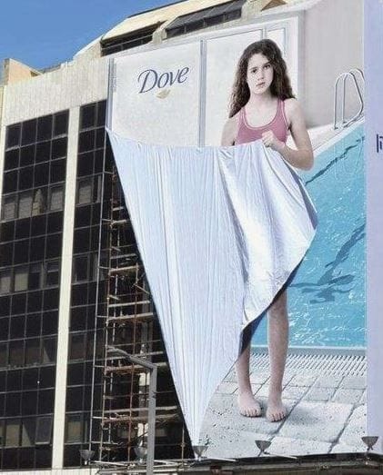
1. Dove's 'Girl Outdoor'
Dove is known to use its platform to challenge the perception of beauty around the globe. In this particular case, the beauty product manufacturer used the banner itself to show a show girl shielding herself in order to raise awareness on the issue of young womens' poor body image and encourage girls and mothers to join the conversation.
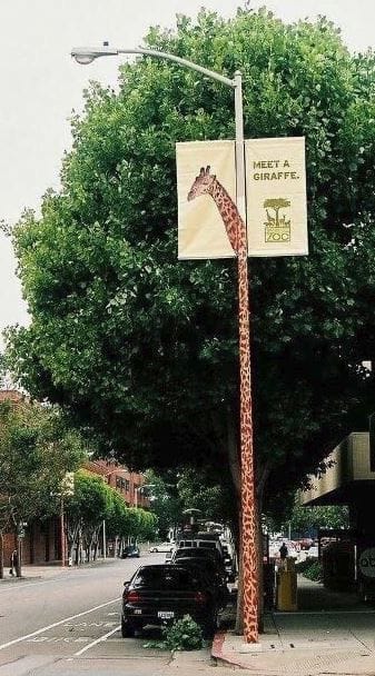
2. San Francisco Zoo
San Francisco Zoo used street banners to introduce some of their exotic inhabitants to the city's locals. In addition to the poster displaying a portrait of a giraffe, the zoo also cleverly transformed the lamp post into the animal's neck, thus creating a three-dimensional effect.
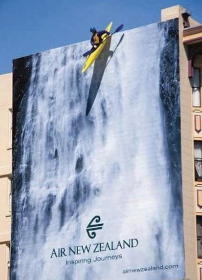
3. Air New Zealand
Air New Zealand uses larger-than-life print banners to advertise adventurous and breath-taking destinations they can fly you to around the world. In this head-spinning example, a waterfall is brought to life by a man in a kayak mounted to the top edge of the building.
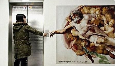
4. Dr. Kim Plastic Surgery
A plastic surgeon referenced Michelangelo's The Creation of Adam to advertise his practice near the elevator doors in (what we assume is) his office building with the tagline 'Be Born Again'. When someone pressed the elevator button, they inevitably became part of the iconic painting.
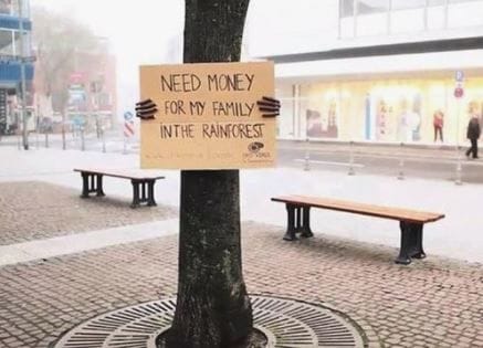
5. OroVerde
This simple yet powerful print banner ad by the non-profit OroVerde proves that big is not necessarily always better. As part of a fundraiser to fight further destruction of the rainforest, they printed their campaign message on 600 pieces of cardboard, that were then tied to trees. Instead of drowning people in scientific facts, it featured a single sentence: "Need money for my family in the rainforest."
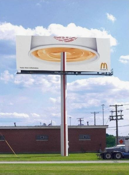
6. McDonalds Thick Milkshake
McDonald's is notorious for clever billboards like this one. Here, the fast food franchise is featuring an upside-down version of their popular milkshakes to underline its 'triple thickness'. There's certainly nothing drippy about this one!
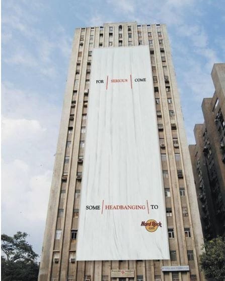
7. Hard Rock Café
This extra-large building banner by the Hard Rock Café is interactive advertising in its simplest yet finest form no mobile device needed. Simply nod your head (headbang) and it will all make sense.
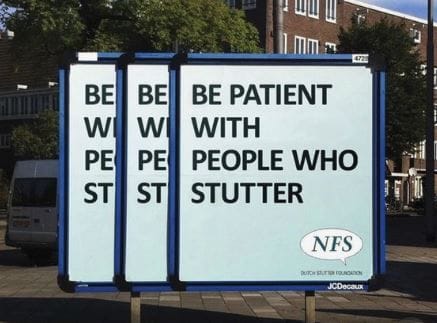
8. Dutch Stutter Foundation
In order to raise awareness for people going through life with a speaking impairment, the Dutch Stutter Foundation used street banners to make the condition more relatable to people who don't live with it.
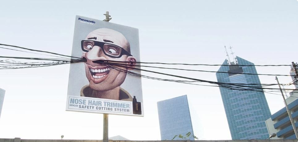
9. Panasonic Nose Hair Trimmer
Panasonic hilariously advertised its nose hair trimmers' safety cutting system by placing ads in unexpected, yet strangely appropriate, places. The campaign involved several illustrated billboards mounted on electrical poles in Indonesia, cleverly incorporating their city environment.
As these ads prove, you should never underestimate the power of a banner ad and your imagination. If you can dream it up, someone can print it!
Contact your local Snap Centre now to learn more.
)
)
)

