7 summer shades to brighten your prints this season
)
As we get closer to summer, a fresh Pantone colour palette has arrived on the design scene. This season's hues are uplifting, confident and playful, portraying feelings of optimism and warmth. What more do we want from this time of year? Here are our top picks to use in your print designs this summer.
1. Flame Scarlet
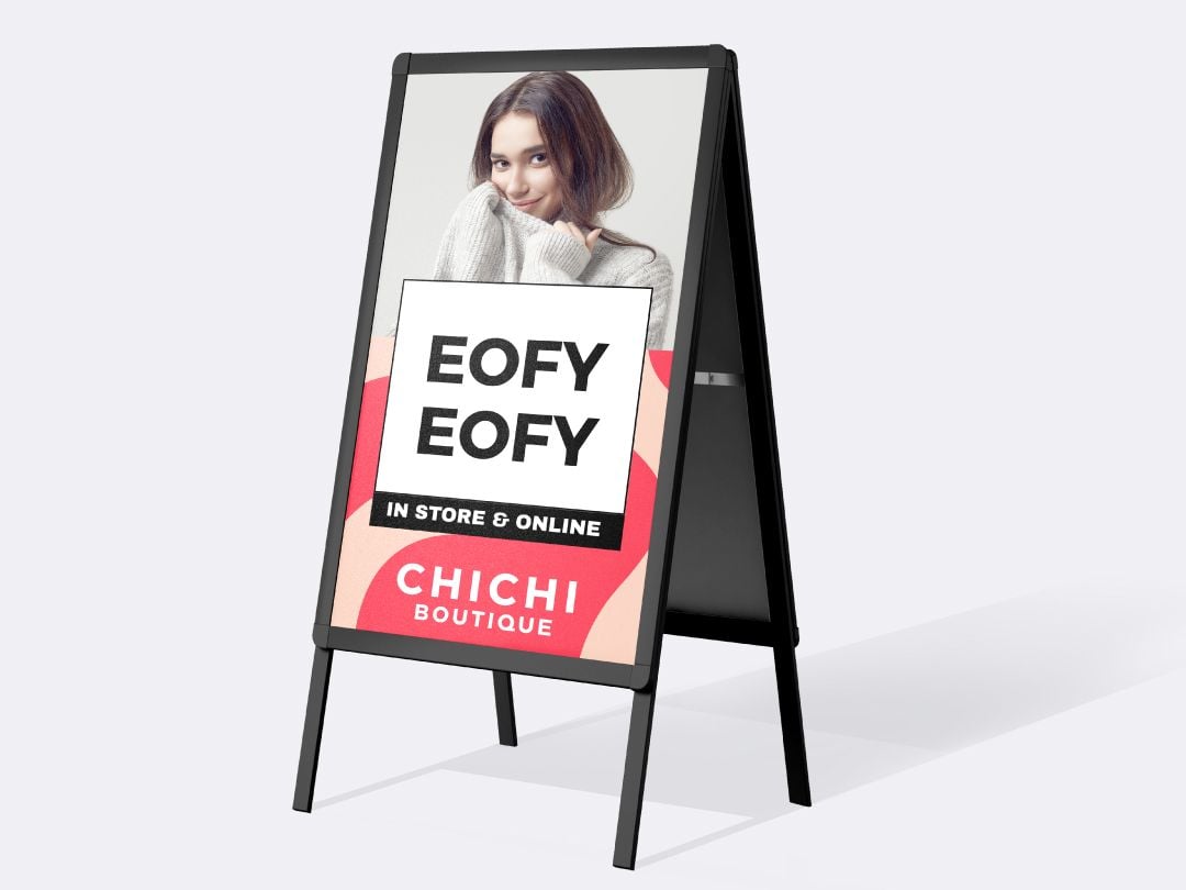
Red is arguably the most powerful colour in the palette, and this season's Flame Scarlet certainly stands out and makes a statement. Use it sparingly on design elements you want to draw attention to, as well as where you want to exude energy and passion.
2. Saffron
According to Pantone, "pungent Saffron adds a flavourful brilliance to the palette". By combining orange tones with ongoing favourite mustard, it offers a fresh, but sophisticated vibrancy for the summer season. Try pairing it with muted greys, whites and blacks to release its full effect.
3. Biscay Green
The aqua shade of Biscay Green draws your mind straight to the ocean. Cooling and refreshing, it can act as a palette cleanser for the eyes when used in your designs. Though versatile, using it with yellows, pinks, greens and whites can complement that summer feel perfectly.
4. Orange Peel
Combining the energy of red with the happiness of yellow, this zesty Orange Peel can add a "tasteful tang" to your print designs, communicating strong, tropical, creative vibes. Like red, it's best to use it sparingly to avoid your material looking like a Fanta ad.
5. Mosaic Blue
The eye-catching, bright blue can be used to add depth but also an element of fun to your designs. Pantone describes this colour as having mystique and grace, but it also conjures up images of a bright blue summer sky. Try pairing it with Orange Peel, or off-whites for a more muted look.
6. Sunlight
Delivering another summer reference, pastel-coloured Sunlight takes the mind to vanilla ice-cream and sandy shores, giving off a whimsical feel and smiling presence. For designs that pop, team it with pastel pinks, blues and whites. It also looks great with grey.
7. Coral Pink
Combining pink and orange, Coral Pink is fresh and invigorating but also warm, welcoming and feminine. It looks especially stunning when combined with light blue and white in your prints. Alternatively, it can be lifted with yellow or paired back with navy blue, taupes and greys.
Whether you want to create bright, playful designs that pop off the page or infuse your promotional material with a more subtle summer vibe, these trendy shades can give your customers, and your business, something to smile about.
Learn more about choosing the right colours for your next print here or contact our experts at your local Snap Centre.

)
)
)

