Introducing The Pantone Colour of the Year 2023
)
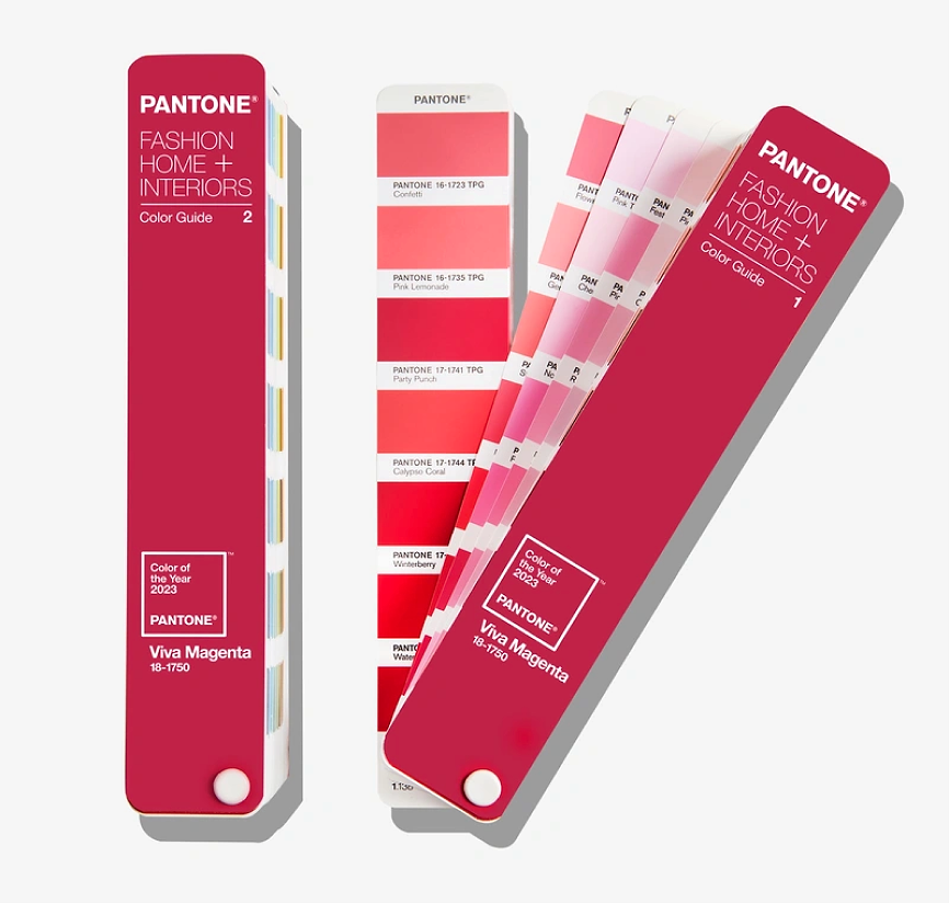
The highly anticipated Pantone Colour of the Year 2023 has been announced as Viva Magenta, with the code Pantone 18-1750. This bold pinkish-red offers a burst of energy and optimism that could be ideal for your upcoming design and print projects.
Let’s take a closer look at why this colour was chosen; the origin and purpose of Pantone’s Colour of the Year; and how you could use this trending colour for your own business.
Why was Viva Magenta the chosen colour for 2023?
Pantone has described Viva Magenta as an “unconventional colour for an unconventional time.” In the third year of a global pandemic, Viva Magenta brings a vivid, audacious and rebellious energy that’s much more exuberant than the chosen colours in past years.
This new colour was chosen to provide a sense of natural authenticity in a technological age. In particular, Viva Magenta draws inspiration from the red cochineal beetle: an insect that’s native to Mexico and South America and has long been crushed and used as a red dye. This beetle’s vivid colour has been used in everything from ancient dyeing techniques, through to modern candy and cosmetic manufacturing.
The fact that Viva Magenta is so bold, joyous and inclusive means that it could be an ideal inclusion for your graphic design, packaging and printing in 2023 and beyond.
What are Pantone colours?
Pantone colours have provided a way to communicate and match consistent colours since 1963, when the Pantone Color Institute developed the first standardised colour reproduction system known as the Pantone Matching System (PMS).

The Pantone Matching System (PMS)
The Pantone Matching System is a way for designers, manufacturers, printers and others to classify and produce colour in a consistent way. The designer of a product or publication can request a particular Pantone colour code from a printed card, with the certainty that the colour of the final item will be a genuine match. The Pantone Matching System is used widely and has become a go-to colour matching system across design, fashion, textiles, product design, art and much more.
The Pantone Colour of the Year
Pantone released its first Colour of the Year in 2000, and every year since a new colour has been released to reflect current cultural trends. The selection process can take months of in-depth research. To choose each year’s colour, the Pantone Color Institute considers many aspects of society: from fashion to home décor, pop culture, technology and even politics. The Colour of the Year both anticipates and influences social trends. For example:
In 2020 the Colour of the Year was Classic Blue, offering a sense of dependability and reassurance in the first year of the COVID-19 pandemic.
In 2021 there were two colours: solid, reliable Ultimate Gray and a vibrant yellow called Illuminating.
In 2022, a periwinkle blue called Very Peri was chosen to imbue creativity and cautious optimism.
And in 2023, Viva Magenta is set to bring with it a sense of joy, exuberance and wit.

How the Colour of the Year influences Marketing Trends
Because of its ability to both forecast and affect trends, the Colour of the Year can widely influence manufacturing and marketing: from clothes, to furniture, to retail advertising and branding. The power of colour is well documented, and effective choice of colour can shape consumer perception and even behaviour. In one 2015 marketing survey, 85% of customers said colour affected their purchasing decisions. The Colour of the Year can have the power to comfort, to inspire and to persuade.
As such, we can expect to see Viva Magenta trickle through any number of products and marketing designs in 2023 and beyond. This colour has already been used for collaborations across smartphones, wallpaper, art and shoes so far.
How can you incorporate the Colour of the Year for your business?
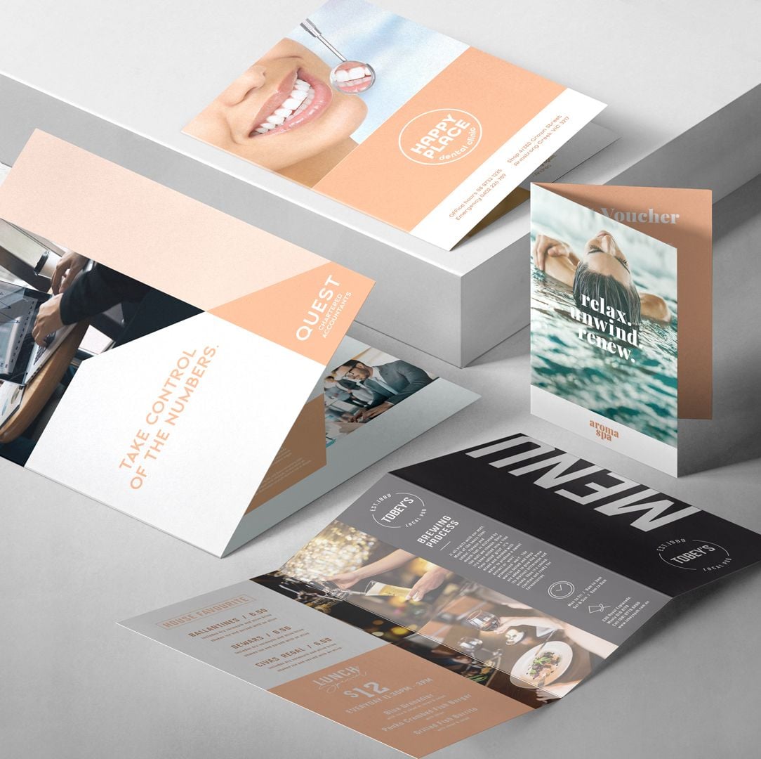
If you’d like to add some bright vim and vigour with Viva Magenta this year, you could incorporate it into your products, brochures, flyers, retail marketing, packaging or even your corporate branding and business cards.
Of course, how you use Viva Magenta will depend on the right colour format for your business. You can convert Pantone 18-1750 to other colour formats using online tools - just be mindful that doing so may mean variations in the final colour. A fairly close match might be:
Hex code: #BB2649
RGB: 187, 38, 73
CMYK: 20%, 98%, 65%, 07%
There’s also a dedicated hashtag for this year’s colour. #COY2023 can help you gather inspiration and explore how other brands are using Viva Magenta.
Practical tips for designing with Pantone colours
Pantone Connect (previously known as the Pantone Color Finder) can be used to convert and create colour palettes for your design, and there are a number of online colour conversion tools available.
If you’re wondering which colours to use with the 2023 Colour of the Year, Pantone has released seven harmonious shades as part of the #magentaverse including:

And if you’re looking for something that will make your design pop, try teal, mint or cadmium green for complementary colours that will contrast well with Viva Magenta.
Lastly, remember that the Pantone Colour of the Year is anything but mandatory! It can be a great option to add a sense of fun and energy to your products, branding or packaging. Just be sure to think about the psychology of colours and the message you’re looking to share with your customers or clients.
Looking for help with colour or design?
We know Pantone colours and colour matching can be somewhat of a complex area. Sometimes you might have something specific in mind but may not know how to implement it .
Snap is here to help with all printing services! You might like to request design services from one of our Snap graphic designers. We can assist with specialty printing requirements including Pantone matching, embossing, spot UV, foil stamping and more.
For in-person support, simply get in touch with the Snap printing centre closest to you today.

)
)

