7 brilliant business poster examples that anyone can make their own
)
A poster that blends clever strategy with eye-catching creativity is one of most captivating, and cost-effective ways to reach, connect with and convert customers.
Plus, the magical charms tat posters possess work on all kinds of audiences, from local shoppers and passing traffic to event attendees, fans of your project and more.
But what makes one poster a star, and another an extra?
For all they're great potential, posters are like every other marketing tactic you use.
Eye-catching alone is isn't enough to make sales. A poster can be a creative masterpiece, but if it doesn't appeal to and influence the target audience isn't not a great business poster.
The seven core elements of a great business poster include:
- A smart, unique idea - something that is relevant to the audience and evokes curiosity immediately.
- Understandable elements - even from a distance the headline, catch phrase or main subject matter has be legible and magnetic.
- A clear layout - so information I easy to find on the poster
- A point of focus - a photo, illustration, text, etc that is central, and then surround it with its supporting details.
- Important details emphasised - for example, using colour and size to showcase an event or call to action.
- The right typography - try a variety of typefaces that convey a certain mood or theme.
- Only what's needed - make your poster loud, yet simple, by removing elements that distract rather than add to the main goal.
Examples of creative, strategic business posters
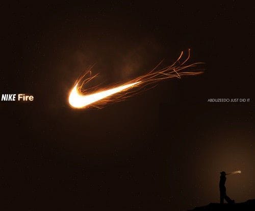
Nike Fire
While Nike ads tend to be a bit more controversial these days, this Nike Fire ad is an excellent example of a simple concept that's also eye-catching and aspirational for it's target audience (golfers).
Play around with images in Photoshop (or cheaper option, even free ones) to blend colours and create fascinating moods and visuals that also reflect your brand.
Apple
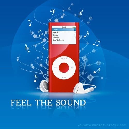
Apple show the power of using contrasting colours to draw attention to your product. Red is a naturally captivating colour that works well on the more mellow blue. The strong white headline and musical notes compliment to say it all.
This would work as well on a roadside billboard as a shop wall.
80s anthem event
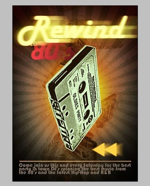
A favorite graphic designer trick for drawing attention to your centerpiece is to blur the background. What makes this poster so powerful is the large old school cassette it's an unusual sight in the 21st century, so it naturally creates curiosity.
Plus, it's highly relevant for the occasion and will probably make some people who see it yearn for the old days and come along.
Even blurred, the background itself has an 80s feel through its blend of textures, style and colour.
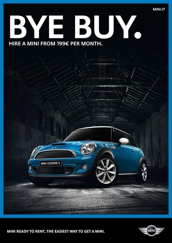
Mini
The prefect example of a short, curiosity building headline and strong image working together to overcome a problem, promote a benefit and increase desire.
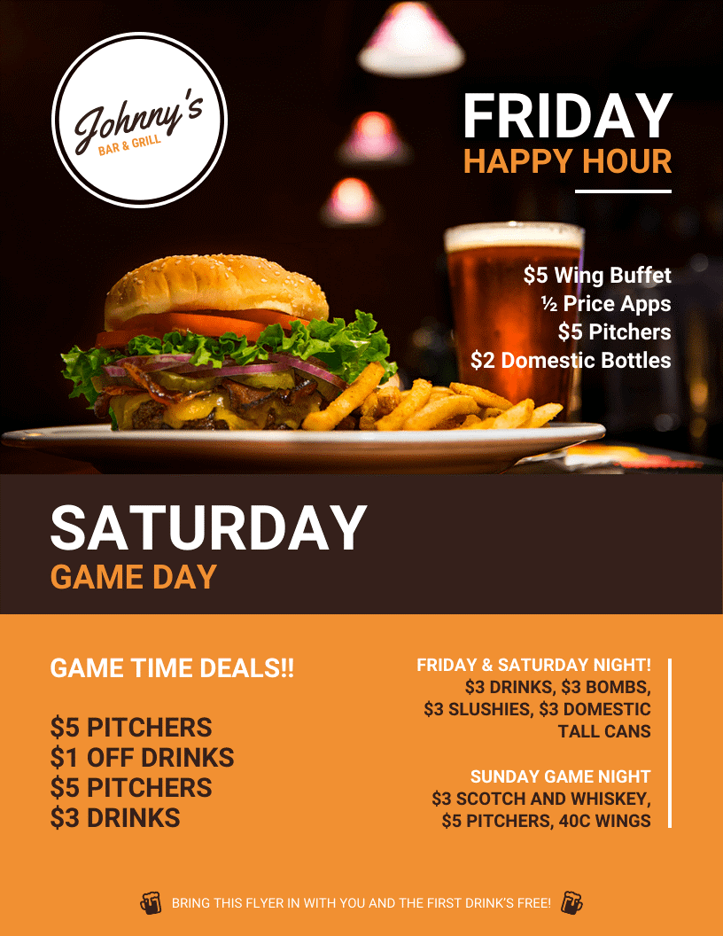
Johnny Bar & Grill
We like the way this flyer/poster promotes two different nights without over-cluttering the space.
The headlines are clear, with simple supporting body text in easy to read fonts.
The visuals work well with the headlines a tasty burger and beer (the focal point) for Friday happy hour, and dark text on the lighter background for game day. If they'd added a sports image at the bottom there would have been conflicting focal points.
Finally, they have clear calls to action that prompt people to come along. You could include a redemption code, or do as they have at the bottom, telling recipients to bring the flyer in for a free drink.
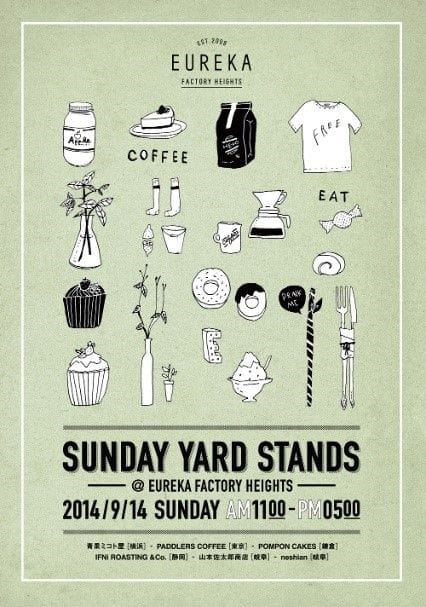
Eureka
This hip clothes store in Japan incorporates the company's personality into their poster design using quirky line illustrations to show the kinds of products you can buy at their yard stand event.
Even if you don't know them, the poster says a lot about the type of business it is, what they sell and their personality.
Even a more conservative business could do something similar, using more serious looking images, etc.
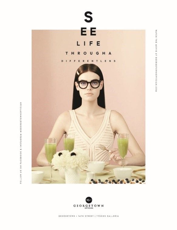
Georgetown Optician
This Washington based optician chain has a reputation for creative marketing they've even made a short film about the history of the business using a fictional family, the Voorthuis.
The girl below is the fictional daughter, Irene Voorthuis, in one of the series of posters where fonts are the star of the show as they juxtapose eye chart typography with portraits.
How could you use fonts as the star of your posters? In case you're still not sure, here are a couple of bonus examples
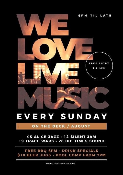
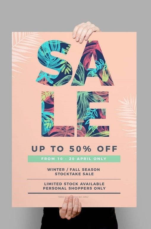
As you can see, the best posters are simple, clear and creative. Just as importantly, they influence the target audience's emotions, thoughts and actions.
If you'd like some professional advice and help getting your poster design and printing right, call or visit your local Snap Centre graphic design and printing expert today.
)
)
)

